Craft is the newest hottest thing in The Netherlands. A lot of Dutch Design, exhibitions such as Hand Made in Museum Boijmans van Beuningen and the event Meesterlijk in Amsterdam are examples of the new idea of craft, how to use it and how to value it. In recent years there has been an upgrading of the phenomenon craft. But what exactly is craft and who are the craftsman behind all these beautiful objects?
Vakpracht is a new Dutch website gathering all those craftsmen. At this site you can find craftsmen such as a soap boiler, an embroiderer and even a bookbinder :)
If you are looking for a specific product or genre, you can use Vakpracht to get in touch with the craftsman you are looking for. But connecting consumers with craftsmen is not the only purpose of this site, Vakpracht also supports craftsmen by sharing knowledge about doing business, giving workshops and by being a forum so craftsmen can share there knowledge, or ask questions at colleagues.
Want to know more about this practical site, take a look at www.vakpracht.nl. You can subscribe yourself to the newsletter, or you can follow the blog at the homepage. Of course you can also find Vakpracht at several social media channels, such as Twitter, Facebook or Pinterest. Since a few days Prien is also part of the Vakpracht community at http://www.vakpracht.nl/profiel/prien/ ... only in Dutch ...
Monday, February 24, 2014
Saturday, February 22, 2014
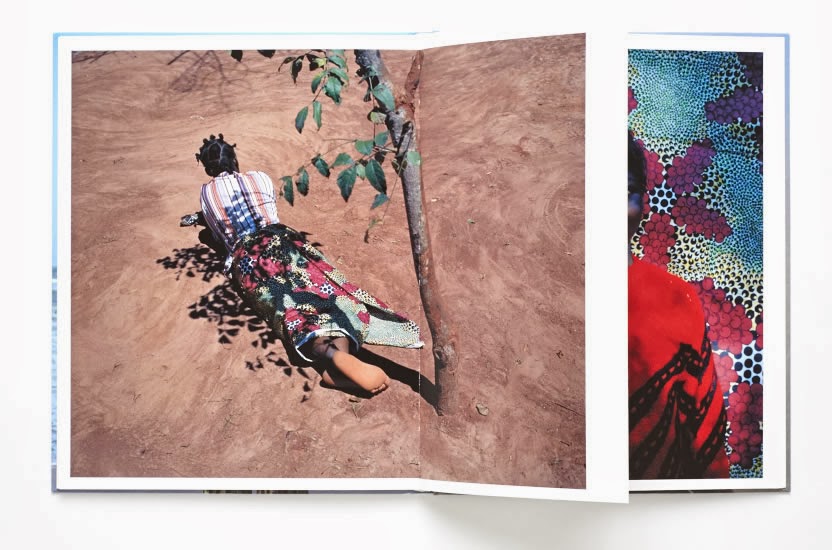
Photo Book Flamboya by Vivianne Sassen
I bought this book before starting as a bookbinder, just because I liked the photographs and the opening text by Moses Isegawa. What strikes me today, besides the photographs, which I still admire deeply, is the way this book has been bound. To do justice to the photographs, they are printed book height in the right proportion, which means that a picture is often wider than one page. The solution is that the quires consist of cut off pages. Besides a good platform for the wider photographs, it also offers an exciting view to the next page.
Monday, February 17, 2014
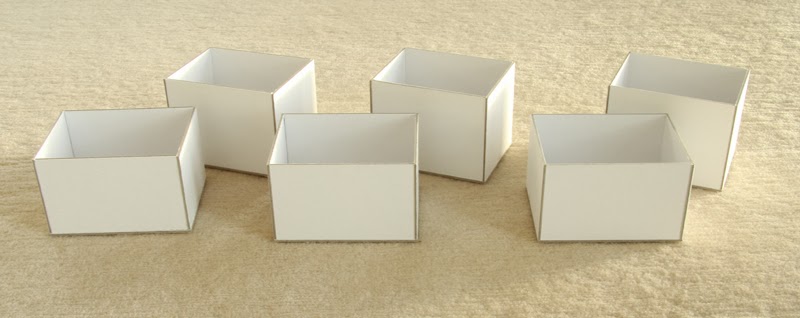
Prien's Photo Boxes
A few weeks ago we were on ski holiday with some friends. It was such a great week! We had a lot of hard and long good laughs, interspersed with serious talks and it was just great to be with each other. Of course we skied a lot as well, the snow was great and we even had some sunny days.
Afterwards I had such a good time sorting the photos. All those crazy selfies were hilarious. The quality of the photos -especially the indoor and night photos- wasn't always good enough for enlargements, so I chose for Polaroid sized photos. To make the photos firmer I glued them on white photo board, this gives the images a tough look. One can shuffle as much as he or she wants. Line up all the selfies, or show the area, or the way he or she skies. In short - a very flexible and stylish way to stock photos.
To keep the photos together I made photo boxes in several colours, matching the person the box was for. It was a precise, but nice job to do the maths. Thinking, cutting, glueing, good music, some sunshine and good memories ... in short a happy moment for a bookbinder!
Saturday, February 8, 2014
Object Rotterdam
Today was a a typically Dutch day, grey, heavy showers and a lot, and I mean A LOT of wind, so it took me some courage to decide that I really wanted to see the Object Rotterdam Fair at the other side of the Maas. Luckily, in the afternoon the showers were blown to the east and I only had to deal with the wind, so the decision was made; GO.
The design objects were located in Rem Koolhaas' new building The Rotterdam, Rotterdam's biggest building, overseeing the city from the south side of the Maas. The enormous building offered a great exhibition space. The main exhibition was at the ground floor and in the lobby, but the more interesting objects were given a more interesting location as well; the apartments in the tower. So we also got a chance to enjoy the beautiful view from the 30th and 44th floor. Unfortunately for the present designers the spectacular view took away a lot of the visitor's attention ...
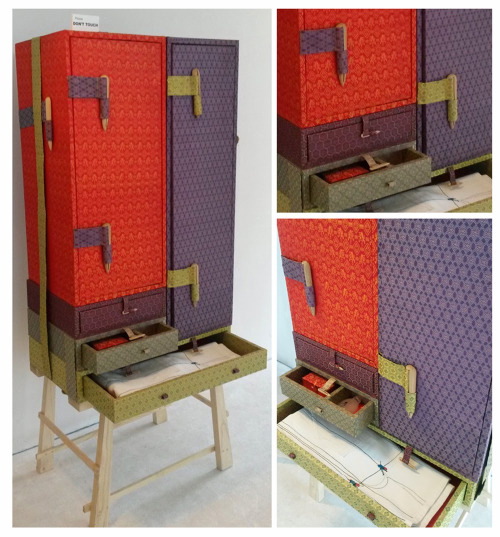
Besides the view, one of the most beautiful and inspiring objects I spotted during my visit was this amazing 'Japanese Binding' closet of Studio Makkink & Bey. Of course that's not the real name of this special design, but it's the first thing that came in mind seeing this beautiful designed cupboard. The typical Japanese bone clasps are extremely enlarged, which gives the closet it's Asian look.
Wednesday, February 5, 2014
Marimekko in De Kunsthal
Last weekend I visited the opening of the refurbished Kunsthal in Rotterdam.
The Kunsthal organized a big party, with several performances and new exhibitions; something I couldn't miss :) At four o'clock sharp I met one of my best friends in front of the Kunsthal. Time to go in .. lots of people on the street, but where was the entrance? The old entrance was closed, so we decided to follow the crowd ... finally we entered the building, through what felt as the backdoor... Once we were inside and found out where we could find the performance of The Kik - a Dutch beatgroup - we also heard that the Kunsthal was very proud to introduce her new main entrance .... haha we never found it, because afterwards we also left through that 'backdoor' ... a mystery that still has to be solved...
Despite of the entrance-problems, there was a huge crowd, which made it almost impossible to see any of the Marimekko designs. The retrospective of Marimekko's designs and the meaning of this famous Finnish company over the years was one of the opening exhibitions. I only caught a glimpse of the beautiful designs, patterns and dresses, so I have to go back to take a better look! But, I was lucky that I already could take a sneak peak at these beautiful designs in the book Marimekko in Patterns - a nice gift from my dear friend -. It made me even more curious!
I really admire Marimekko, of course for their designs, patterns and products, but also for their way of doing business. Craftsmanship, quality, knowledge, intuition and pleasure are the basics for their designs. Nowadays Marimekko has stores all over the world, from New York to Tokio, but the production is still based in Finland. In these days of cheap, cheaper and even cheaper than that production, Marimekko explicit chooses to keep the production close to the designers, so improvements can be made easily and they don't lose their craftsmanship and thorough knowledge of their materials and production process.
A nice quote from the book I want to share with you:
"We need dark to see light, grey to grasp colour, work to notice playfulness,
emptiness to appreciate life..."
Monday, February 3, 2014
Personalized Notebooks for Clever Strategy
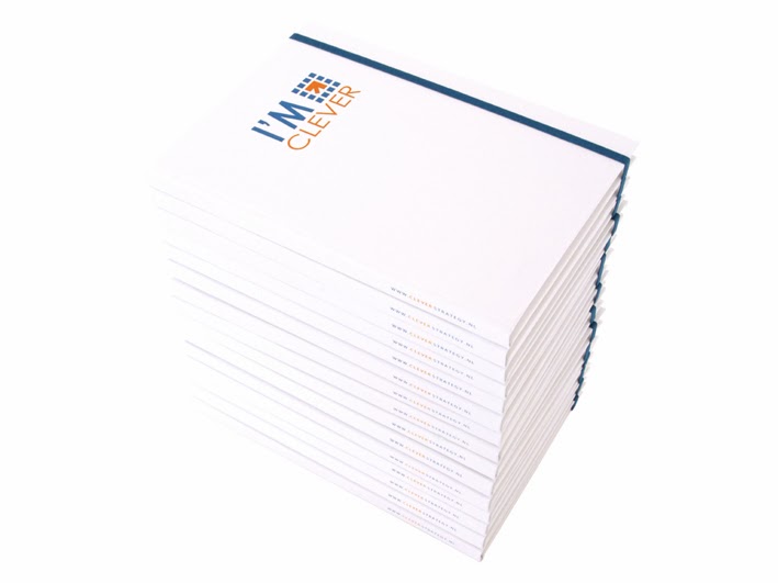
Just before a relaxing ski holiday Prien finished a nice assignment for Clever Strategy. This company, specialized in marketing and technique, always sends its customers a new year gift. This year they wanted to send a marketing calendar combined with a notebook.
The logo of Clever Strategy is blue and orange, in close consultation we have chosen to put the logo in the middle of a white cover, supplemented with a blue rubber band to close the book. The spine of the booklet contains the url. and the logo with caption is centered at the bottom of the back. To raise the white cover and pages of the notebook, the flyleaf is bright orange. It was fun working on these cheerful booklets and I got inspired by the marketing calendar, so at the moment I am busy planning my year, using the events mentioned in this inspiring calendar.
Want to receive this handy booklet, become a client of Clever Strategy :)
Subscribe to:
Comments (Atom)


